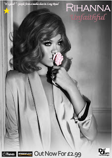
In what ways does your media product use develop or challenge forms of real media products?
Our music video follows Goodwin’s points by the music matching the lyrics. This was done with the use of slow action, Lip syncing and choosing to have the video in black and white. Also, the story of our music video matches the lyrics as it about a girl that has left the lead singer of the group which matches the visuals for instance when the lyrics say ”and if I was late, then im sorry” we showed bens girl walking away from there meeting point. The genre of the track was Indie Rock, so to convey this we took inspiration from a song by 3 Doors Down which showed a good band performance which we used in our final product. However our band performance wasn’t as good as we had hoped because we had little musical knowledge. To try to fix this we used individual shots for different instruments and also filmed from slightly weird angles to help cover up the fact we didn’t know how to play the song. In our video we also used some intertextuality through the close up of bens trainer and also when he is writing on his iPhone. The locations we used were kept relatively simple for example we filmed in the woodland area around Long Road. We felt this fit well the genre we were trying to convey as it showed in our research that indie bands use simple and sometimes obscure locations. The clothing used in our media product also followed conventions of this genre
How effective is the combination of your main product and ancillary texts?
I think that our three products work very well together. The main video is purely in black and white, while the Magazine Ad and DVD Cover are very dulled down colour which still fits well the theme and genre of the video. We added a lot of blur and distortion to our Magazine Ad and DVD Cover. This makes the lead singer feel isolated and alone which fits with the genre and also fits with the video as lead singer ben is almost always pictured alone which adds a link between these products. Our music video and ancillary tasks attract the target audience as they use many conventions of the genre such as loneliness. The locations used in the three tasks are also kept relatively the same for example the video was shot in the woodland around Long Road and the picture on the Magazine Ad was also captured here with sun in the background. The picture on the DVD cover was captured with ben standing on the wall with the sunset and woodland in the background. There is a very clear link between locations used across our products. By using a slightly more colourful image for the Ancillary Tasks we hoped to draw in our target audience more and get them interested in the story/ feel of the video.
What have you learnt from your audience feedback?
We read all the feedback from our peers on our final video. We were very happy with the positive feedback for example the black and white effect had achieved what we had hoped.
One piece of negative feedback was the instruments performance as it was clear we didn’t know how to play instruments. We understand where they are coming however we felt we needed to give it a go as it was one of the conventions of our genre and we tried to use fast cuts to hide the fact we didn’t know how to play.
Some negative feedback we felt was wrong for example “not enough locations”. As a group we felt we had a good number of locations including indoors and outdoors to give it variety and cut between regularly to keep the viewer interested.
We have learnt that we needed to be much more in depth with plan and have a very clear storyline for our video.
How did you use new media technologies in the construction and research, planning and evaluation stages?
During the making of our products we used Final Cut to give our video a professional finish in terms of editing. We used cuts and fades as our main transitions, these gave the video a nice flowing feel to without it being too jumpy. Also when editing we used effects such as black and white by adding colour correction to our video and then taking the saturation out. This was used throughout the video. Also in Final Cut we used a shot of ben changing the studio dials and synced it with a volume, this gave the impression that ben had turned up the volume of the track.
During the creation of our magazine ad and DVD cover we used Photoshop to allow us to easily manipulate our picture and add realistic text and logos. We used tools like the smudge tool to erase unwanted background items for example the picture we ended up using had a person in the background and we used this tool to blend them into the background. We also used blur as an effect on almost everything except ben which gives a sense that he is important.
To research the conventions of our genre we used mostly the Internet including sites like Google, Wikipedia and YouTube. These allowed us to find out what video of this genre are likely to look like and took many ideas from them. Whilst filming we used HD video cameras to allow us to record high quality footage very quickly and efficiently. For our Magazine ad and DVD cover we used a professional stills camera to take more photographs for use on them. Using this we were able to take many pictures quickly from different locations to get one that is perfect and so when we edited it we had many options with what picture we used.


